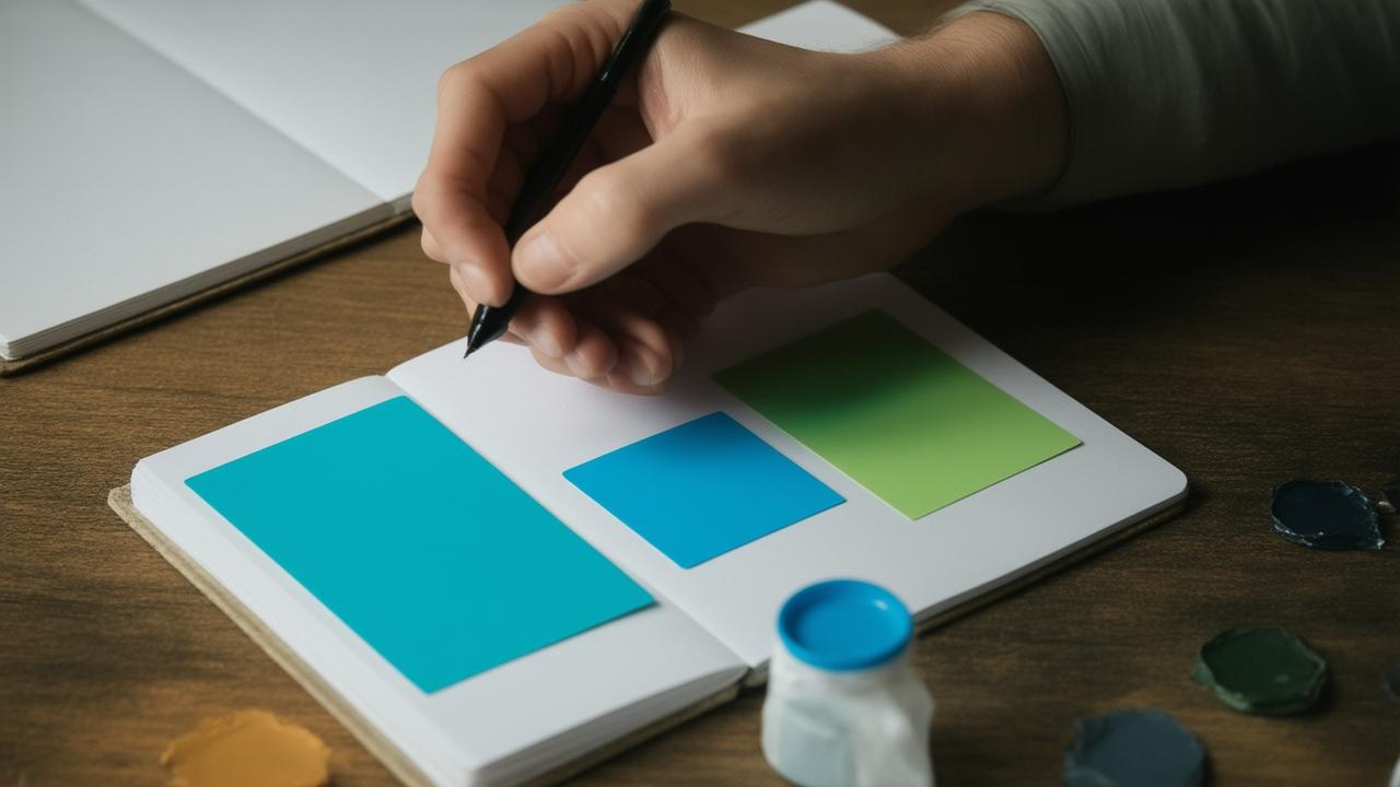
The first thing you notice is the light. It pours across the lab table in a late-afternoon hush, turning the stack of color cards into something almost sacred. Blues, pinks, grays, greens—small rectangles fanned out like fallen leaves. Across from you, a researcher in a soft wool sweater asks you to sort them. “Just pick the ones you feel drawn to,” she says. You shrug, thinking this is simple, a bit silly even. You start arranging. But as your fingers move, an odd feeling rises in your chest, the same vague tightness you get before a hard conversation. On the surface, you’re choosing colors. Deep down, something else is choosing you.
When Color Feels Like a Secret You Didn’t Mean to Tell
In psychology labs around the world, color has quietly become a kind of soft mirror—one that reflects not your reflection, but your insecurities, your doubts, your self-constructed armor. We talk about “favorite colors” the way we talk about favorite songs or snacks: casual, harmless, a quirk of taste. But the more researchers study the emotional undercurrent of color choices, the more they notice repeating patterns—especially among people whose self-confidence tends to fray under pressure.
Over the last decade, several research teams, from university psychology departments to clinical counselors working with color-based assessments, have traced consistent threads. Not “if you like blue, you must be shy” levels of over-simplification—but subtle, recurring preferences that cluster around people who walk through the world with a fragile kind of self-assurance. You know the type: seemingly fine, even cheerful, but easily rattled by criticism, hungry for reassurance, building and rebuilding their sense of worth like a sandcastle near the tide.
What these teams began to notice was almost like emotional fingerprints: three color directions that kept showing up, again and again, in people who described their confidence as “shaky,” “dependent on others,” or “strong only when things go right.” Not a diagnosis. Not a label. Just a quiet echo in the palette they reached for when no one told them what was right or wrong.
The Three Color Preferences That Kept Coming Back
The first surprise isn’t which colors show up—it’s how softly they arrive. Most of us imagine fragile self-confidence as something big and dramatic, but in the lab, it looked more like hesitation. People didn’t reach for the boldest hues. They reached for the colors that felt…safe. Gentle. Muted. The ones that didn’t shout too loudly in a room.
Across different studies and informal clinical observations, psychologists kept seeing three recurring color gravities among participants with lower, more easily shaken confidence: a pull toward very soft pastels, a lean into dusty or washed-out neutrals, and a complicated, push-and-pull relationship with intense reds. Each group of colors seemed to offer a different sort of shelter—or battlefield.
1. The Soft Pastel Sanctuary
Picture a drawer full of clothing in pale blush pink, baby blue, lavender, and foam-soft mint. Or a phone case in muted peach, a notebook the color of chamomile tea with milk. These are the colors that feel like a quiet room and a gentle voice saying, “It’s okay, you’re safe here.”
People drawn consistently to these very light, soothing hues often described themselves as sensitive to criticism and deeply affected by the emotional “weather” of others. One researcher noticed how often participants who marked high on self-doubt gravitated toward cards that “didn’t make waves”—colors that didn’t demand attention but invited comfort.
It isn’t that pastels cause fragile confidence; more that they match it. When your inner world feels easily bruised, soft colors can function like emotional padding. They suggest harmony, gentleness, and non-confrontation. “If my personality could be a room,” one participant said, “it would be that really soft pink-beige where no one raises their voice.” It sounded cozy—and a little like hiding.
2. Dusty Neutrals and the Art of Not Being Seen
Then there are the quiet grays. The putty beiges. The faint, earthy taupes that hover between presence and absence. These tones showed up repeatedly in the selections of people who described themselves as “trying not to take up too much space.”
Spend time in a modern office and you’ll see them everywhere: greige walls, stone-colored upholstery, sweaters the color of concrete before rain. In the lab, when participants with fragile confidence gravitated toward these tones, they often used phrases like “calming,” “professional,” or “non-distracting.” Underneath those words, researchers heard another: safe. Safe from being noticed, safe from being judged.
There is a quiet elegance to these colors, no doubt. They carry a sense of restraint, composure, subtlety. But for some people, they also become a shield. If you already feel like your worth depends on not making mistakes, not attracting too much scrutiny, then dusty neutrals can become the visual equivalent of stepping back into the shadows. You’re there—but less. You hope that if you blend in, no one will look too closely at the parts of you that feel unfinished or uncertain.
3. Red: Attraction, Avoidance, and the Fear of Being “Too Much”
Red is its own story. It doesn’t slip into the room; it charges. It’s the color of exposed hearts, flashing warning lights, and lips that say what they mean. You might expect someone with fragile self-confidence to avoid it completely. And some do—they flinch from it the way you’d back away from a spotlight.
But here’s where it gets interesting: psychology teams kept encountering a particular pattern. Many people with shaky self-esteem had a conflicted response to strong reds. They admired it. They talked about wanting to be “the kind of person who could pull off red.” They would choose red as an accent—a lipstick they rarely wore, a mug, a single piece of art—but rarely as the main color of a room or outfit.
Red, for them, symbolized the self they wished they had: bold, certain, unconcerned with what others thought. Yet stepping fully into it felt dangerous, as if being that visible would invite judgment they weren’t ready to face. “I love red,” one participant admitted, “but it feels like it would expose me.”
How These Colors Whisper About Our Inner Stories
Color, in this context, isn’t a lie detector test or a secret key to the soul. But when psychologists layered color preferences over interviews, self-report scales, and body language, they began to see meaningful overlaps. Certain hues acted like emotional metaphors:
- Pastels mirrored the desire for emotional cushioning and protection.
- Dusty neutrals echoed a wish to be present without drawing too much attention.
- Reds represented a tension between the longing for boldness and the fear of exposure.
Imagine someone who walks through life braced, even lightly, for disapproval. They’re not collapsing under it, but they’re always scanning: Is this okay? Did I say the wrong thing? Am I enough today? Over time, that vigilance seeps into the smallest choices—what they wear, how they decorate their space, what they feel comfortable holding in their hands. A deeply saturated color might feel like a risk. A soft one feels like a sigh of relief.
Psychologists sometimes describe fragile self-confidence as “other-regulated”—held together by external reinforcement rather than an internal, stable sense of worth. If so, these color choices can be seen as attempts to manage that external world: to stay lovable, non-threatening, pleasing, or unnoticed enough that rejection feels less likely.
Where Science Ends and Your Own Sensing Begins
Does that mean if you love pale pink, you secretly hate yourself? No. Human beings are far more intricate than any color quiz would suggest. Culture, trends, childhood memories, and simple aesthetic joy all shape what we find beautiful. You might love gray because your grandfather wore a gray sweater that smelled of pine and safety. You might despise red because of a uniform you were forced to wear. Context matters.
What the research teams have emphasized is not using color as a weapon of armchair diagnosis, but as a starting point for self-inquiry. Your color choices become interesting when they repeat, when you feel oddly restricted by them, or when a whole category of hues feels off-limits—too loud, too demanding, too “not me.”
➡️ Goodbye balayage : “melting,” the technique that makes gray hair forgettable
➡️ Forget Burj Khalifa and Shanghai Tower: Saudi Arabia now readies a bold 1km-tall skyscraper
➡️ Doctors under fire as they warn seniors with joint pain to avoid swimming and Pilates and choose this unexpected activity instead
➡️ According to psychologists, the simple act of greeting unfamiliar dogs in the street is strongly linked to surprising and highly specific personality traits that reveal more about you than you think
➡️ Every autumn, gardeners make the same mistake with their leaves
➡️ France ships 500-tonne nuclear ‘colossus’ to power the UK’s new generation III reactor at Hinkley Point C
➡️ NASA will say goodbye to the International Space Station in 2030 and welcome commercial space stations
In therapy, some clinicians gently invite clients to explore new colors the way you might explore new roles or boundaries. A woman who always wore pale tones tried, slowly, to introduce deeper colors into her wardrobe as she worked on asserting herself. A man who clung to gray and black experimented with small bursts of saturated blue as he loosened an old belief that he needed to be “invisible to be acceptable.” The color changes didn’t fix their confidence, but they gave form to inner shifts already underway.
| Color Tendency | Common Emotional Theme | Possible Inner Question |
|---|---|---|
| Very Soft Pastels | Seeking gentleness, safety, and emotional cushioning. | “Will I still be accepted if I’m not easy to handle?” |
| Dusty / Washed-Out Neutrals | Desire to blend in, avoid scrutiny, stay controlled. | “Is it safer if no one looks too closely at me?” |
| Intense Reds (Admired, but Used Sparingly) | Tension between wanting boldness and fearing exposure. | “What happens if I let myself be fully seen?” |
Letting Your Palette Grow With You
There’s a small, quiet power in noticing your own patterns without judgment. Maybe you open your closet and see mostly soft, non-argumentative tones. Maybe your living room is a symphony of gray, beige, and off-white, interrupted only by a single red cushion you’re unsure about. Maybe your notebooks and apps, your water bottle, your backpack—they all hum in the same safe key.
Instead of accusing yourself—Ah, so I’m insecure—you might ask softer questions:
- What do these colors give me emotionally?
- What am I afraid might happen if my world became more vivid?
- Is there a color I secretly long for but don’t “let myself” choose?
Color can be a way of practicing courage in miniature. You don’t have to start with a red suit or a cobalt wall. You can begin with a pen. A mug. A scarf. You can try on a bolder hue and see what stories bubble up: This is too much. People will stare. This isn’t me. Whose voice is that, really? When did you first learn that being visible was dangerous?
Psychology teams will keep running their studies, collecting data points and refining theories. But you don’t have to wait for a journal article to tune in to your own quiet experiments. Notice how you feel sitting in a room of different colors. Notice which shades you reach for when you’re tired, anxious, hopeful, or proud. Your preferences aren’t verdicts; they’re weather patterns. They shift as you do.
One day, perhaps, you’ll walk past a shop window and see something in a color you used to avoid—a jacket in a fierce red, a journal in an unapologetic teal—and instead of shrinking back, you’ll feel a small, surprising steadiness. You’ll reach out, fingers brushing the fabric or the cover, and think, Maybe it’s time. In that moment, it won’t just be about color.
FAQ
Does liking pastels or neutrals mean I definitely have low self-confidence?
No. Color preferences are influenced by many factors: culture, trends, personal memories, even lighting. Research only suggests that certain color gravitations often correlate with fragile confidence, not that they cause or prove it.
Can changing the colors I wear or live with actually improve my self-esteem?
Color alone won’t rebuild self-worth, but it can support the process. Using bolder or more varied colors can help you gently practice visibility, boundary-setting, or emotional expression while you also work on deeper beliefs and patterns.
Is red always linked to confidence?
Not always. Some confident people avoid red; some anxious people love it. In studies on fragile confidence, red often appears as a color that is admired but not fully embraced—a symbol of a bolder self that feels slightly out of reach.
How can I explore my color preferences without overthinking them?
Try noticing, not judging. Keep a simple note on your phone about the colors you reach for over a week: clothes, objects, digital themes. Then ask how each color makes you feel rather than what it “means.” Use curiosity instead of analysis.
Should therapists use color tests to diagnose self-esteem issues?
Most ethical practitioners see color-based tools as supplemental at best. Reliable understanding of self-esteem comes from conversations, history, behavior, and standardized assessments—not from color choices alone. Color can open doors, but it shouldn’t be the whole house.